
The brand’s art direction aims to be both classic and transgressive, in the spirit of its subject matter. Their products, likewise, balance the intensity of their taste with sweet and smoky flavor profiles.
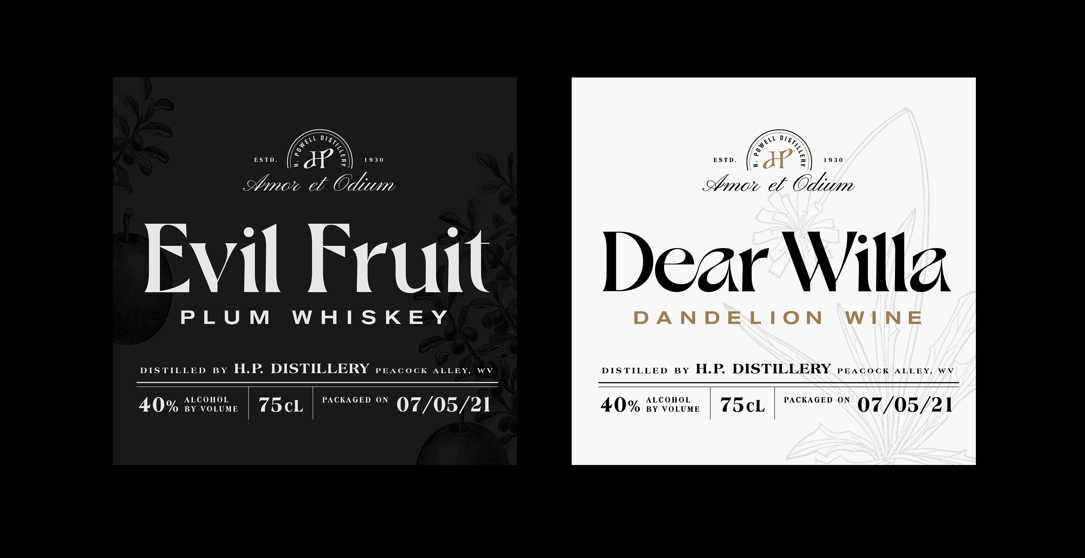

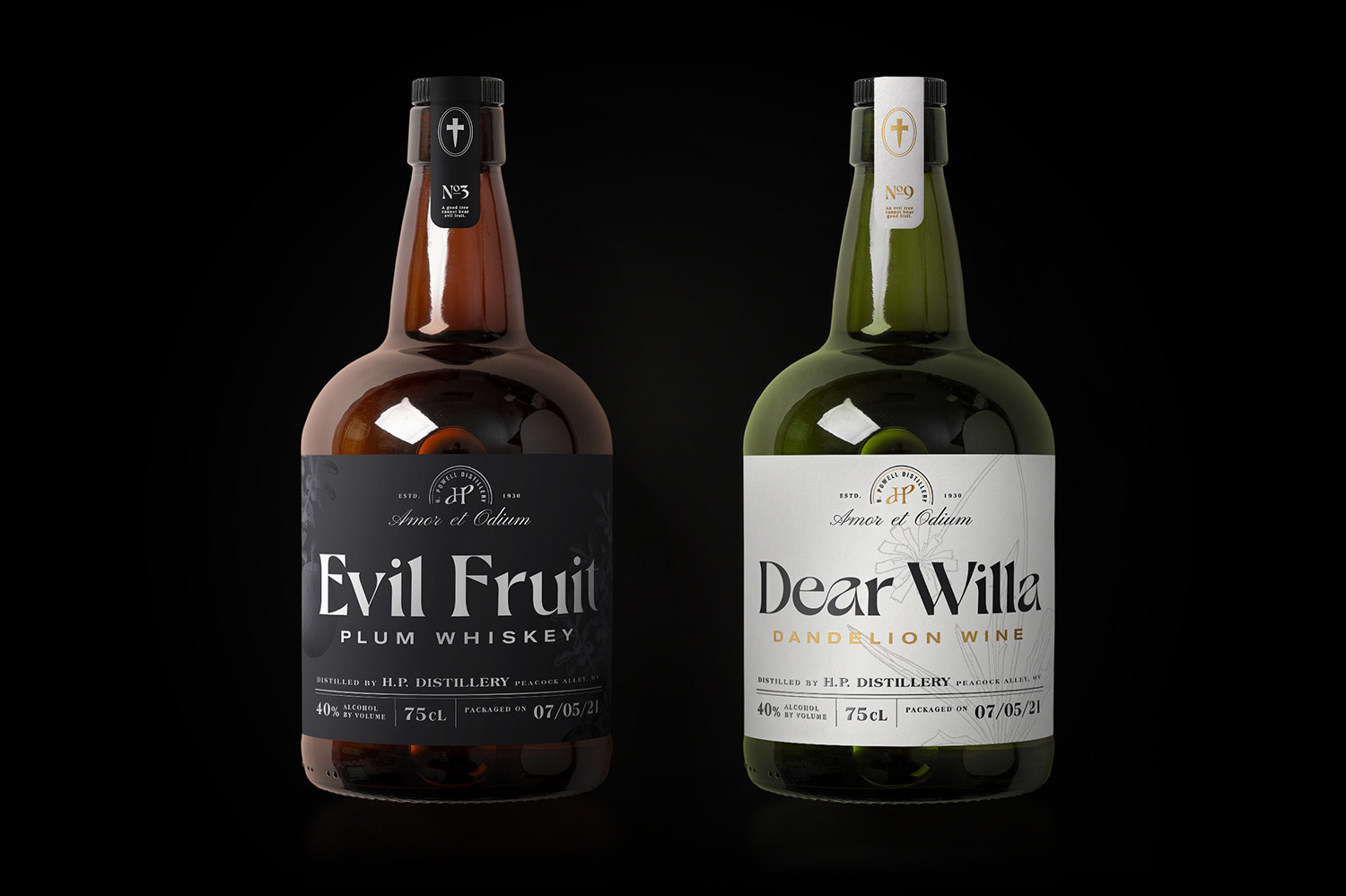
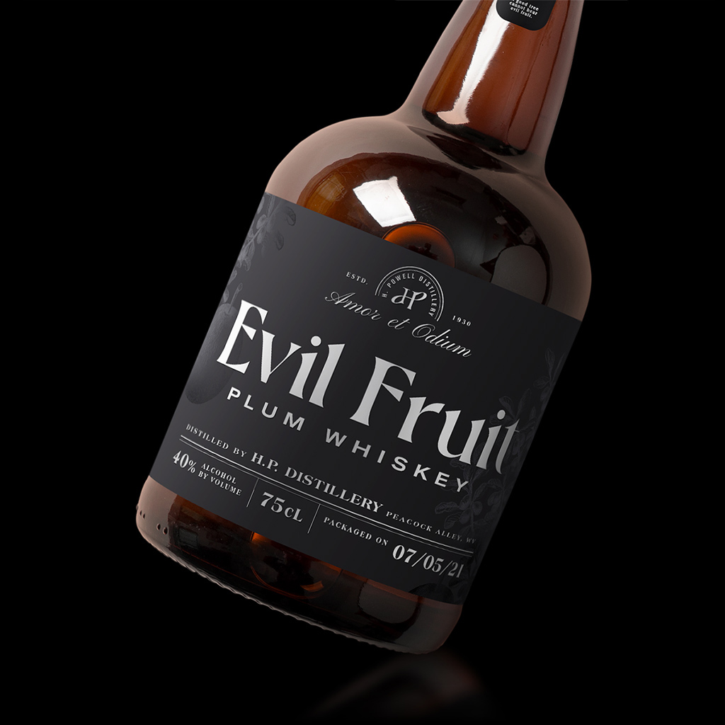
The design challenge was to modernize the Gothic aesthetic, in both senses of the term. Product names are set in Dahlia, a sinuous but sharp-edged “Jugend-ish” typeface. Parts of the label were also inspired by Victorian typography and American ephemera of the 1930s, but are designed using techniques and conventions of today.


AMOR ET ODIUM | AKVDZN 2021